Websites have become an integral part of all business activities which is why it is important to hire an established website design company that will build you a personalized website to kickstart your business properly. Statistics show that close to 70-75% of people use their smartphones for all activities which include but are not limited to entertainment, forming connections on social media, buying commodities, and running businesses too. But before you get in touch with various branding companies to discuss how you want to elevate your brand, it is important to understand your requirements when it comes to how you want your website to look.
Creative agencies across the world understand that digital enterprises are the present and future of commerce which is why they design websites based on two types of designs – responsive and adaptive. All website design services include skilled developers who excel at responsive and adaptive websites but it is important to know where you stand as a brand and what kind of approach will suit your eCommerce website better.
Many people use the words responsive and adaptive interchangeably and even though there is a very subtle distinction between both these categories, it is significant enough to make a whole lot of difference when it comes to the style, intent, cost, and time required to create these designs and today we will discuss these so you can make a sound decision for the same.
So let us first understand the difference between responsive and adaptive eCommerce designs and the pros and cons of the same, shall we?
Responsive Design by Definition
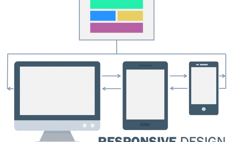
In these modern times, people use their smartphones all the time and the remaining time gets compensated by using desktops and laptops. So it is crucial to build a website that is fit for all kinds of devices. Responsive websites are the perfect example of this need, as they are designed keeping in mind the fluidity with which the websites can be opened on various platforms without changing the overall design and content. Coined by Ethan Marcotte, responsive websites get created with the help of CSS and the fluid grids don’t change the overall look even if you open the website on a laptop, a desktop, smartphone, or a tablet.
A web designer/developer must keep in mind various layouts that he/she is catering to because these adjustments will eventually make or mar the success of the website. Elements like the adjustment and resizing of the images, fonts, colors, and orientation need to be looked at properly and adjusted without hampering the resolution of the website.
The Pros of Responsive eCommerce Websites
- The biggest pro for responsive websites is that they are cost-effective because the developers can build one seamless and fluid design that fits all.
- Responsive designs increase reachability and have a good loading speed which decreases the bounce rate immensely. People hate it when some websites cannot be opened on the phone or have bad UX on the phone vs on the desktop and that leads to decreased sales too.
- Responsive websites are low maintenance by nature and don’t need a lot of management because a single version is available for all screens.
- Because the developer has made a highly fluid version for all platforms, it is easy to track users and customers, especially when it comes to eCommerce websites.
- You may have to hire a good team of website developers and that may seem costly the first time around but it is a one-time investment that may reap more benefits in the long run.
- SEO works like a charm for responsive websites as the URL doesn’t change so the uniformity impacts the SEO and reachability greatly.
- Many CMS systems go for responsive web designing as an approach as it is an easy way of creating eCommerce websites. Shopify is the best example for the same as it has been made user-friendly for customers to build their own websites.
The Cons of Responsive eCommerce Websites
- Because responsive websites are built to fit all screen types, the loading may not be one of its strongest features and some of the features may not be appropriate for different screens and that may distort some of the elements of the website.
- Responsive designs mostly cater to small screens(fit for smartphones) which may affect the navigation of the website when opened on the big screens and that may hamper the user experience too.
- The different elements keep adjusting and moving around the screen and that may affect the performance and add unnecessary extra loading time to downloads of the website too.
- When it comes to making customized websites, there are a lot of limitations when it comes to responsive eCommerce websites. Because it is built in such a way that regular people can also build websites easily, the need for complex personalized changes gets hampered.
Some of the best examples of responsive eCommerce designs are DropBox and Shopify.
Adaptive Design by Definition
Adaptive designs are exactly the opposite of what responsive designs stand for – every screen has individual designs specifically created to fit them in such a way that these individual grids fit in perfectly as per their requirement. With multiple layouts and breakout points for different screens, what adaptive designs accomplish is adapting the design for different users keeping in mind their different devices. Adaptive designs are also responsible for improving the performance of the website on individual devices as they don’t have to make adjustments.
The Pros of Adaptive eCommerce Websites
- Adaptive websites target specific users and that increases the UX of the website drastically.
- Because adaptive websites are designed for different screens/devices, the designs have incorporated different needs of the users and that decreases the loading time of the websites and all the downloads.
- Adaptive eCommerce websites are perfect for ad optimization as they are built keeping in mind the user’s behavior.
- Each version of the website has been designed to fit different screens in an adaptive website which is why the developers have more control over the UI and UX of these websites.
The Cons of Adaptive eCommerce Websites
- They are not cost-effective as the developers need to build different versions fit for different screens.
- They are time-consuming and that can eventually increase the efforts and costs too as they need more people to work on different versions and that increases the efforts of maintenance too.
- Adding modifications and upgrades becomes difficult in adaptive websites as individual versions need individual coding and that makes it challenging to make new changes from time to time.
- People prefer responsive websites more than adaptive ones because even up-and-coming developers can work on the responsive website and that makes adaptive a choice for skilled professionals only.
Some of the best examples of an adaptive eCommerce website are Home Depot, Nike, Air France, etc.
Conclusion
It is extremely important to understand what the goals of your eCommerce website are and accordingly get a team of developers to design a website for your that ticks all the right boxes. If you are confused about which design suits you best – adaptive or responsive, keep in mind different breakout points like the layout, navigation, consumer behavior, flexibility, and reachability of the website, and accordingly choose a website design company that understands the aspects of both these approaches and provides with solutions that are skilled and noteworthy.
Author Bio: Brijesh Jakharia
Brijesh Jakharia co-founded SPINX Digital in 2005 and takes great pride in crafting web and mobile marketing solutions for mid-market businesses to enterprises. Marketing is his passion, and the thrill to build a brand from the ground up has helped him craft successful brand stories for world-class clients. While not at work, he loves to spend his time on research and reading digital content stories.
Apart from this if you are interested to know about 5 Ways to Market Your Fashion eCommerce Store then visit our technology category.